Microsite Website Layout with Ravish Numbers for stefanseifert.com

Gemma Ward by Patrick Demarchelier · Ravish Ultrafine Numbers ‘21’
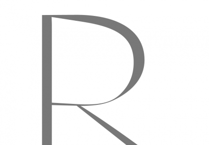
Ravish Ultrafine · Numbers
I added these ultra thin numers only years later. The idea was still to create something similar to Helvetica, but to add some elegance to its lines. I see also the influence of a very old Sans Serif font come to be forgotten once known in Germany as Akzidenz Grotesk. Which has the stressed upper parts on the ‘2’ in particular.

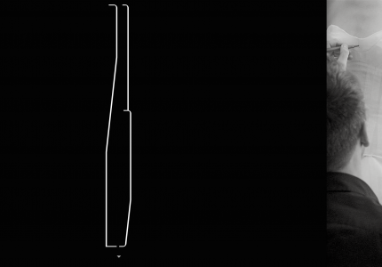
‘a’ Bowl Elaboration: Insert Curve Point and View Control in Metrics Window
A particularly exhausting task in the design of this ultralight character was the detailed curve treatment. Even though using an extra large scaled letter template surface to avoid problems with a too rigid digital raster every time I returned to this font to undertake some modifications (as I use to do with all my fonts over the years) it took me a while and big efforts to going deep into the refinement of its large and extra thin curves.
Just doing two parallel lines with Béziers in that size and so narrow each to another being hard enough it becomes even harder if you wish to add some dynamic treatment to it. It certainly helps to insert in between curve points, yet, this evokes a somewhat badly balanced curves character “wobbly on its legs” (making too many of them).