- Typeface: Incantation
- Work: Research
- Date: 2000
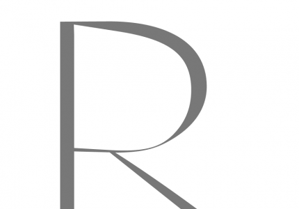
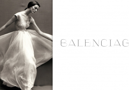
As part of my research work for , Italy, namely for a GQ magazine concept there remained some ultra classicist typefaces that weren’t used in the end. One of them is Incantation, a daring and mostly very experimental character. It breathes the air of and others referring to its extreme contrast between stems and hairlines but it looses all their curves. They were replaced by strictly rectangular diamond like shapes. Its title derived from a fashion story by . Its inspiration came from couture dresses and one its most dominating elements that is that of lace material. Like few others this material reflects femininity with an air of mysticism around it.
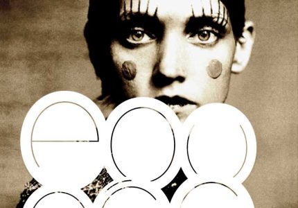
Later on I used its strictly geometric forms for a personal research about ’s brand. I imagined the ‘I’ as kind of a perfume bottle or package on which mystic black and white couture shoots should be projected.
Credits:
| Photography
- Typeface: Incantation
- Work: Research
- Date: 2000